As Lester Freamon from “The Wire” says
You follow drugs, you get drug addicts and drug dealers. But you start to follow the money, and you don’t know where the fuck it’s gonna take you.
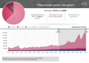
The State of Working America has created an interactive chart that allows one to see how growth in average income was shared between the richest 10% and the other 90% of Americans. It’s a very cool tool and here is a chart that I created that should explain pretty quickly why there must be higher taxes on the rich.

Since 1977 100% of income growth in the US has gone to he richest 10% of Americans. (Click to enlarge)
For extra credit make charts that use historical tax rates to see what lower taxes on the rich has done for the other 90%.


