
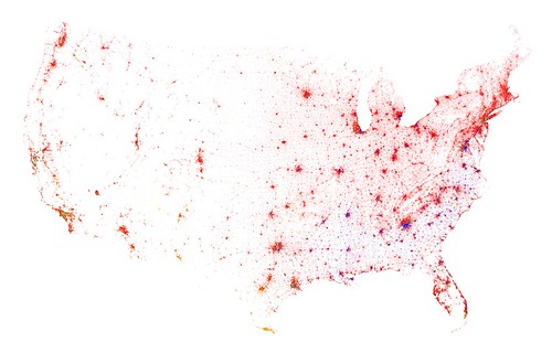
Here’s something good for wasting away (but not really a waste) a couple of hours, Race and Ethnicity Maps from Eric Fischer. He’s taken the 2010 census data and created city maps with dots that represent skin color according to where we live. It’s amazing to see just how stringent the color lines still are. Segregation? What segregation?
The Contingent U.S.
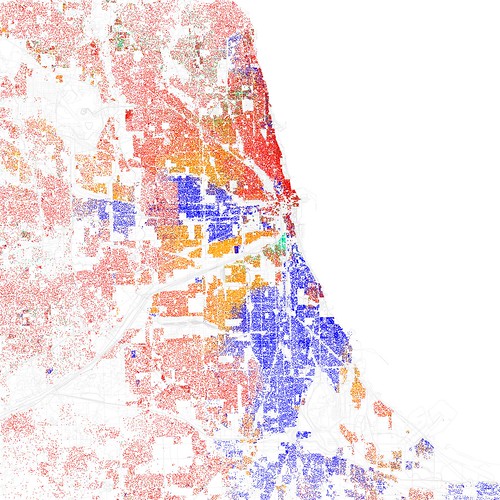
Chicago-Red is White, Blue is Black, Green is Asian, Orange is Hispanic, Yellow is Other, and each dot is 25 residents.
Check out a bunch more on his Flickr here.