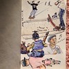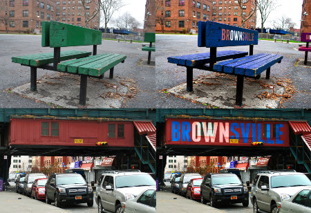
Mock up identity for Brownsville, Brooklyn
Far be it for me to say a fresh coat of paint and some pretty letters are going to revolutionize a neighborhood but, hey, it’s a start. For one, it shows that at least someone is taking care and taking pride in where they’re from and pride oftentimes has that bandwagon effect. In a positive way.
Probably the greatest example provided in the “Rebrand Your ‘Hood for Good” article, at Good.is, is the ultra-iconic “I heart New York” logo by Milton Glaser (check out my love/hate variation of it, here) which helped jumpstart the city’s revitalization at a time of rocky circumstances. The article also touches on the above mock up for Brownsville (M.O.P., what!) done by SVA students and the story behind Zak Stone who created a city-specific font for Chattanooga to help bolster its “creative renaissance.”
Read the whole thing over at Good.