Archive for design

The First Ever Saturday Morning Link Roundup

Some of you know me. Some of you don’t. That’s okay. DC Dan has asked me here to provide links that I find during my regular Internet prowls. A few sources will be obvious if you’re already hip to my patterns. If you recognize where I got every single one of these, we should probably have a chat. Here we go, deep breath… Pull!

Smash TV – Memorex

Bicycle security

Cello fortress

History of wooing women

The Fire This Time -  Warrior Dub (Prime Thought Meet Mannaseh Remix)

Goedzak: Because One Man’s Trash Is Another Man’s Treasure

Mixtape USB Drive

Heritage unit excitement

Heavy Metal Parking Lot

The Cookie Dough Lover’s Cookbook
Loaded Revolutionary War Cannon found in Central Park

Major Scaled

Girlfriend in Canada

Euphoria

GI BCS & Four Loko

Dear Abby

Free Schwabylon

Glass Farmhouse

Strange Fruits

Giraffes necking

Spray here, not there

Share

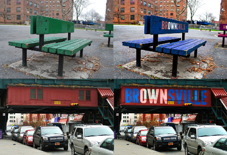
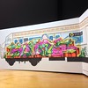
Rebrand Your ‘Hood for Good

Mock up identity for Brownsville, Brooklyn

Mock up identity for Brownsville, Brooklyn

Far be it for me to say a fresh coat of paint and some pretty letters are going to revolutionize a neighborhood but, hey, it’s a start. For one, it shows that at least someone is taking care and taking pride in where they’re from and pride oftentimes has that bandwagon effect. In a positive way.

Probably the greatest example provided in the “Rebrand Your ‘Hood for Good” article, at Good.is, is the ultra-iconic “I heart New York” logo by Milton Glaser (check out my love/hate variation of it, here) which helped jumpstart the city’s revitalization at a time of rocky circumstances. The article also touches on the above mock up for Brownsville (M.O.P., what!) done by SVA students and the story behind Zak Stone who created a city-specific font for Chattanooga to help bolster its “creative renaissance.”

Read the whole thing over at Good.


Share

Race and Ethnicity Maps, All in All We’re Just Dots on a Map

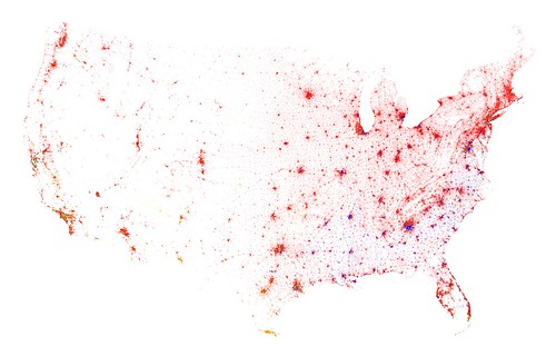
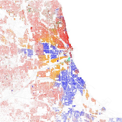
Here’s something good for wasting away (but not really a waste) a couple of hours, Race and Ethnicity Maps from Eric Fischer. He’s taken the 2010 census data and created city maps with dots that represent skin color according to where we live. It’s amazing to see just how stringent the color lines still are. Segregation? What segregation?

Contiguous United States, Census 2010

The Contingent U.S.

Race and ethnicity 2010: Chicago

Chicago-Red is White, Blue is Black, Green is Asian, Orange is Hispanic, Yellow is Other, and each dot is 25 residents.


Check out a bunch more on his Flickr here.


Share

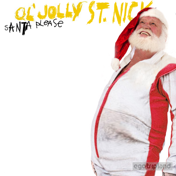
EgoTripLand: Co-opted Xmas Album Covers

Ol_Saint_Nick_Santa_Please

Now you know you need to head over to EgoTripLand to check out the rest.

Share

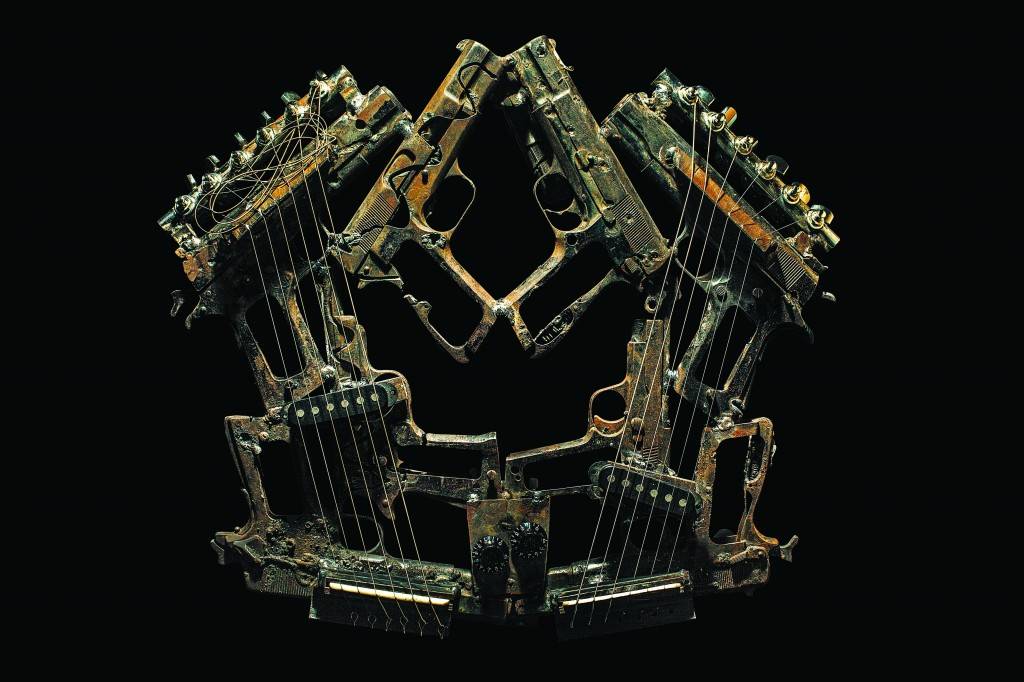
Pedro Reyes, Imagine

Pedro Reyes is an ingenious artist, the kind we love here at the CFC. Building off his project from 2008, Palas por Pistolas (1527 guns and weapons were melted down and fashioned into shovels that were then used to plant 1527 trees), he hits us with ImagineApparently the Mexican government caught wind of his projects and offered him all the metal from a public destruction of weapons they were having in Juarez. He took them up on their offer and this time took to turning instruments of death and violence into instruments of…musical.

“It’s important to consider that many lives were taken with these weapons; as if a sort of exorcism was taking place the music expelled the demons they held, as well as being a requiem for lives lost.”

Video, photos, quotes… Read more

Share

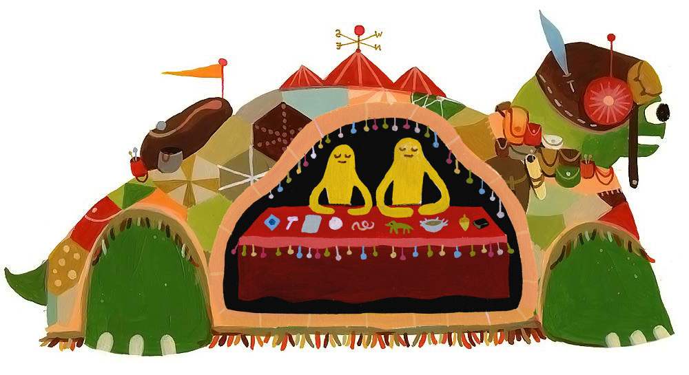
The Trading Tortoise


Part of the whole Common Folk Collective theme of things is appreciating art that is functional and finding ways to live life in creative ways, appreciating the difference between simply creating art and being a true artist. I’m really salty I missed The Trading Tortoise traveling art project when it came through Milwaukee.

Basically Souther Salazar and Monica Choy wanted to take a road trip across the states but also wanted to interact with the communities they drove through and give something back as they went along. Being the creatives they are, it was only logical (in their upside down, wacky, creative universe) that their trip turn into a traveling art project/trading post. They built a Trading Tortoise.

Read more

Share